
By Adam Gruber

The dataset came from the UC Irvine Machine Learning Repository. It looks at a UK retailer from Dec 1st, 2010 to Dec 9th, 2011. This retailer operates exclusively online and sells both as a wholesaler and to end consumers. It focuses mainly on all occasion gifts.
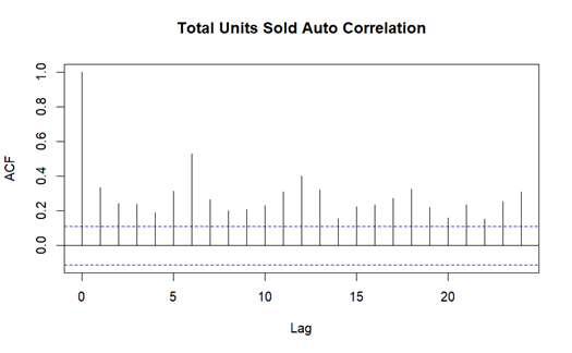
The retailer sees a regular 7-day cycle. This cycle repeats each week. The sales peak mid-week and reach zero every Sunday. The sales cycle is affected by holidays as well. Easter weekend in April 2011 shows an extended break from sales. Retail sales peak before Christmas since this is a wholesaler and will be shipping to retailers. The Tableau and R Studio showed a 6-day cycle.
The auto-correlation graph compares the lag between days and how well they correlate with the starting data point. The graph shows that on the 6th day, there is a higher correlation. This makes sense with the weekly business cycle. The graph shows an increased correlation on all multiples of six, such as on days 12, 18, and 24.
Forecasting should focus on several different areas: sales, units sold, number of invoices, and unique customers. Each represents a different KPI for the business and how to properly measure its success. The number of invoices can be used to calculate if the transactions per customer are increasing in size. The unique number of customers also shows whether the retailer is growing to reach a wider audience. The business can grow just by increasing the basket size from each existing customer up to a certain point. The colors are chosen to bring contrast between actual data and forecast data. The colors were selected to avoid shades common to color blindness. The graphs are stacked on top of each other for easy comparison. A slider for dates was added to the Tableau workbook to allow users to select the exact time frame they want to see. This was useful to fine-tune the forecast rating.
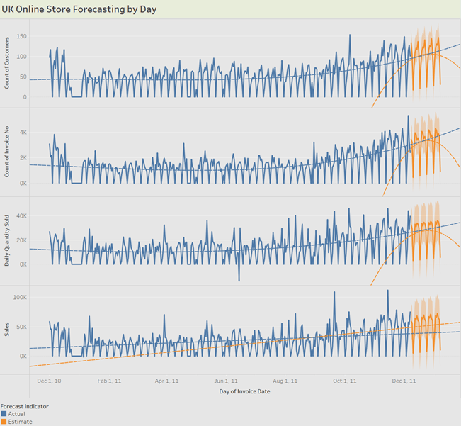
Oct 6, 2011, shows a spike but not evenly across all KPIs. There was no spike in invoices or in sales that day compared to the normal, but there was a spike in distinct customers. This is likely due to a promotion they ran to attract new customers. This brought in an exceptional number of customers but did not generate an exceptional amount of profits compared to normal. The average price per unit fell during that week. The units sold peaked above the trend line but not at the highest point of the sales.
In the data set, 135,080 customers had one purchase or never created a Customer ID. There were 4372 unique customer IDs in the data set. Most customers made one purchase from the site and moved on, but the “whale” customers accounted for the majority of sales. As a wholesale that also sells directly to the consumer, the average person likely makes one purchase, but the retailers continue to come back. The overall retention rate is very low at 3%. If the cost of customer acquisition is low for end-user consumers this is not an issue. But if it costs more than a few pennies, the company would be better off focusing on the wholesale side of the business.
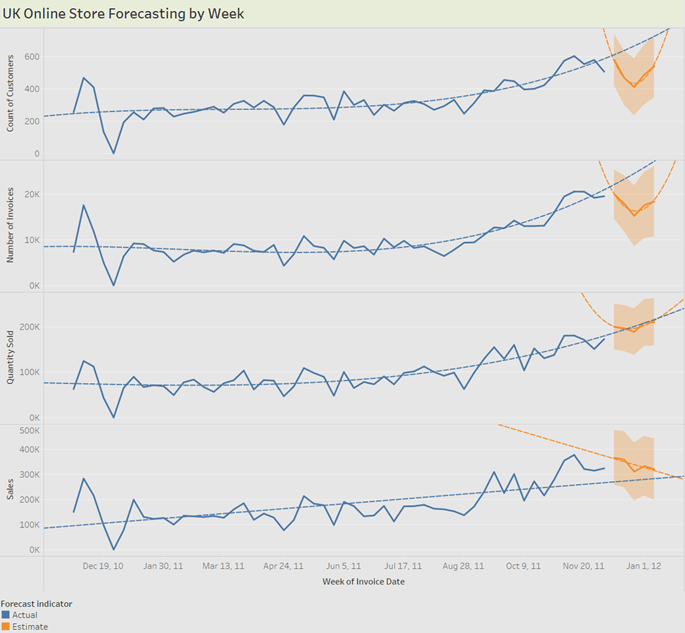
There was a polynomial trend line used. It had the highest correlation to the actual data of R2 =.26 for invoices. The trend line for the weekly data had a higher correlation overall since there was less variation. The highest correlation was R2 =.64 for the weekly quantity sold. There was a higher correlation for weekly trend lines; however, the rating for the overall forecast was poor compared to a good/okay rating for daily forecasts. Reducing the time frame of the data analyzed improved the overall forecast rating and trend line correlation. If the primary goal were to compare year-over-year sales and seasonal increases from Christmas, it would be essential to keep the total year as part of the forecast.
The Weekly Forecast shows a 13-week cycle. The weekly forecast is again stacked on top for easy comparison with the same colors for easy analysis. The forecast predicts a seasonal spike around the beginning of December and a low for the season from the end of December to the beginning of January. The company is a wholesaler and would need to have its products shipped to retailers early in December. The model could be improved by adjusting it for holidays. Depending on the products they sell, different holidays may affect their sales, especially if they enter new markets. Since they are UK-based retailers, UK holidays would have the biggest impact, like Easter, Christmas, and Halloween.
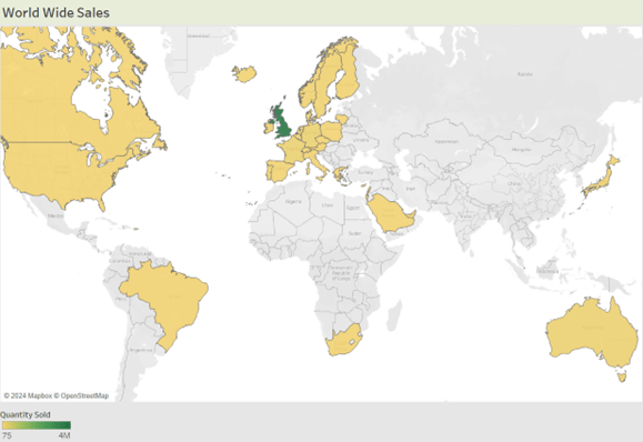
The global sales show it is heavily concentrated in the United Kingdom. The company has an international presence but has failed to capitalize on it. European markets would be the next logical expansion. It already has a limited presence in Europe, with the Netherlands having 200,000 units sold over the time period
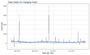
The company’s best-selling product was the White Hanging Heart T-stand. This product had several major spikes in sales. The spike in sales is not related to any major UK holidays. It made up .7% of the overall sales. The company is not dependent on the sales of any one product.
Summary
The company has experienced growth in its sales over the last year. The company was shown to have a few promotional pricing events. These promotional pricing events can be used with machine learning to find the correct pricing that can allow the company to break into new international markets without sacrificing profits. This appeared to be the case for the Oct 6, 2011 sale, where profits were sacrificed. Expanding into foreign markets with different holidays can lead to other sales spikes. This could create a more even and predictable forecast over time. An even forecast could mean the warehouses are always used near full capacity.

Leave a comment